>> Click here to view all images related to this article in our gallery spotlight.
Color is often the focus when people shop for cars, clothes, houses, refrigerators, electronics and, yes — even plants. Color is taught in visual merchandising classes because it is an essential tool. A dedicated industry exists for the study of how to utilize color in product design and display. There are even colors of the year — a Google search for “colors 2016” yields almost 9 billion results!
Plant-related businesses have been slow to incorporate color into their marketing and display strategies. Unfortunately, the water gardening industry remains near the back of the pack. Now is the perfect time to learn about the benefits of applying color to your products, displays and pond designs.
Color Theory and Harmonies
Sir Isaac Newton did more than discover gravity. He invented the first color wheel around 1700. A modernized version of his wheel is still used to explain and help design color combinations. It is an invaluable tool for artists, designers and marketers around the world, because many aspects of color are universal. For example, humans, unlike most animals, can see more shades of green than any other color. Color combinations, or color harmonies, start with a key color and integrate other colors in specific positions around the wheel.
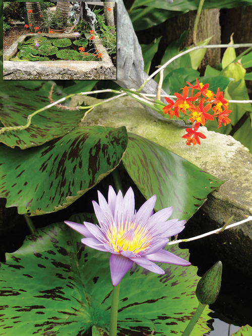
The simplest and most visually powerful color harmony is complementary, with two colors from opposite sides of the wheel. Blue/orange, purple/yellow, and red/green are the main combinations. Once you start looking, you will see examples of these pairs everywhere — logos (FedEx, the Denver Broncos), famous paintings (Van Gogh’s “Starry Night”) and even comic strips (the Incredible Hulk’s purple pants). In the aquatic gardening world, one example of the striking impact of complementary colors is a violet water lily with a yellow center.
Split complementary uses the base color plus two colors on each side of the complementary color. This can be seen in a display of a violet iris and red lilies, surrounded by greens.
Complementary and split complementary are by far the most common color combinations; they also happen to be the easiest to apply in our industry’s merchandising and design. Other color harmonies, while also interesting, are more complex and almost impossible to apply using the items typical of our industry.
Style: Designed vs. Random
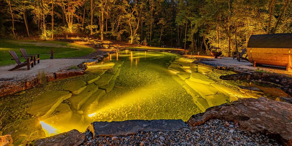
Unlike most products, the focus of the aquatic plants we sell and the ponds we create is visual in nature — these are not eaten, driven or otherwise consumed. They are meant to last for several years. A backyard pond is a serene retreat and creates a beautiful, peaceful, relaxing oasis worth savoring — the stark opposite of display ponds at botanical gardens and jumbled cottage landscape-style gardens, where many different plants are thrown together.

Colors can be one of the strongest tools to direct people’s vision and create a specific mood. They are far more powerful than signage in retail applications and can be crucial in pondscaping. Planned use of color can completely change the character and soul of a water installation or a store display. Pay close attention to every colored element you add. Notice the effect each has from afar and up close. Start with a thorough photographic analysis of your current displays or designs, and then ask coworkers and employees for unbiased feedback, both positive and negative.
Impact: Bits & Blocks
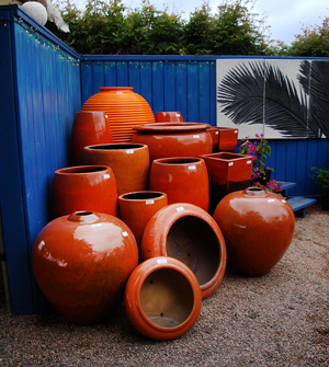
Landscape designers and visual merchandisers have learned the fundamental importance of color masses, as opposed to spot treatments, to draw attention. Masses help to create a unified and planned design rather than a haphazard arrangement. Landscapes with mass plantings are more likely to be considered the work of professionals, not your average, do-it-yourself fanatic. Using large chunks of color to focus attention is called color blocking.
Visual displays become more effective when colors are grouped together. This is enhanced by the complementary color in the shelves blue.
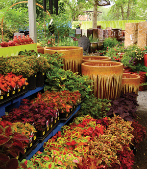
Color schemes can extend beyond blossom colors in the pond. They can easily incorporate things outside the pond, such as the colored pots used by savvy nursery merchandisers to accent the contents and hopefully increase impulse purchases. Other excellent examples include the foliage of a nearby tree, a ceramic accent piece, blue retail display shelves and a colorful fence behind a pond.
[box]Visual displays become more effective when colors are grouped together. This is enhanced by the complementary color in the shelves blue.[/box]
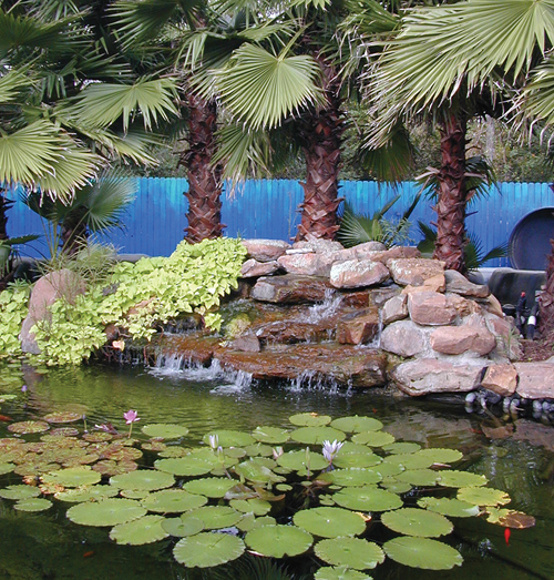
Pond designers use many components that cannot be altered. Green foliage and the colors of rocks are fixed. Additional color may be added with fish, plants, flowering plants, statuary, accessories and background structures. Consider everything when planning your color combinations. Color masses are even more important, with so many elements competing for visual attention.
Water garden plantings have interesting challenges, too. The seasonal growth cycles require creativity to convey what plants will look like in midsummer. Moreover, while in season it is difficult to keep blooming plants in stock. Consider investing in background banners or photos on metal to create custom color blocks — after all, printing weatherproof media has gotten quicker and cheaper. Each panel could feature a different image for the colors of lilies or lotuses you sell. Imagine a photo backdrop of lilies in a pond filled with blue blossoms. That would make an impact and perhaps even inspire a purchase, even if your plants were not blooming.
Let the Customer Add Color
from logos to stunning pot displays.
Customers aren’t always aquatic plant geeks; they often don’t know or care about plant names. So consider starting your conversation with visitors to your garden center with questions about what colors they like. It’s the perfect way to extract information without being pushy, even if they are only window-shopping.
Use a similar strategy when discussing a new pond project with clients. Ask what their favorite colors are. Do they want to complement the home exterior, complement the colors of other landscaping, or use a college team’s colors? Is anyone in the family colorblind? This information is a good starting point before establishing other important considerations of the design.
Just Do It
Color theory is a fascinating topic and helps explain why some color combinations seem to stand out or appear just right. It can be used to your advantage, helping you sell products and installations. Learn as much as you can about color, and put it into practice. Establish your color schemes based on appropriate color combinations. Test them with mock-up displays or Photoshop simulations. Announce your upcoming new look on social media and your website. Celebrate your new look. Use it to engage customers, and apply it to make their ponds even better.
[toggle title_open=”Look and Learn | Close Me” title_closed=”Look and Learn | Open Me” hide=”yes” border=”yes” style=”default” excerpt_length=”0″ read_more_text=”Read More” read_less_text=”Read Less” include_excerpt_html=”no”]
- Search Google images for color visual merchandising, color blocking, garden center color display, etc.
- Cruise Pinterest for these topics.
- Stop by retail department stores to see how and where their displays use color.
- Visit independent garden centers and big box stores to see how they incorporate color into their displays.
- Learn the basic color combinations. Start looking for them in
television, print, landscape design, marketing and product displays. - Collect pond designs with dynamic color combinations.
- Analyze them and adapt the colors to your future designs.
- Read reviews of sites and apps for selecting colors, designing
them to match photos, etc. http://bit.ly/15ColorTools - Soak up everything on the Proven Winners website, from point of purchase[/toggle]
>> Click here to view all images related to this article in our gallery spotlight.